
The Royal Canadian Navy Monument, Messaging Elements
In partnership with Stewart Bailey of Intu Design
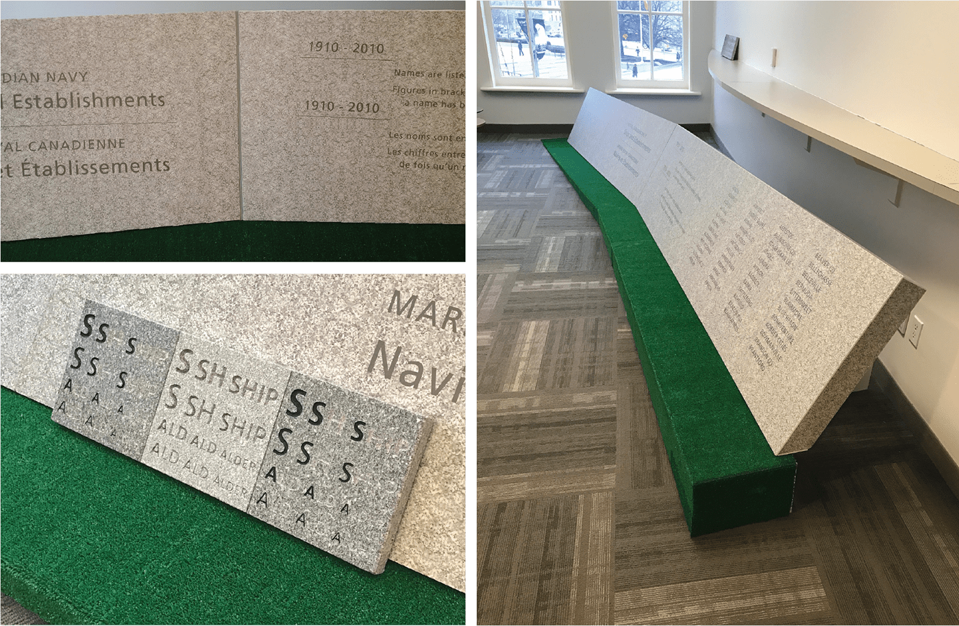
It was an honour to work on the Navy Monument site addition in 2017. We were hired by the National Capital Commission to aid in the design detailing of ‘the Wake’ – a 100-foot granite wall which was to contain over 500 ship names along with introductory text.
The addition to this site was conceived by Dialog Design.
Commissioned by the National Capital Commission and the Royal Canadian Navy.


Material samples were used to test several variables.
- Text sizes: spanning 3/4" - 1 1/2", in both upper and lower case.
- Material finish: polished, steeled, honed
- Material finish: polished, steeled, honed
- Sandblasting profiles: V-sunk, u-shape
- Infill: testing levels of tinting (black), to increase contrast
We decided on the steeled finish for it's matte quality and quiet visual texture (seen in the middle of both samples). The V-sunk profile created a hard shadow, resulting in excellent contrast and eliminating the need for tinting.


We also produced a partial full-scale mock-up to accurately communicate the nuances at play, as they were difficult to communicate on a small scale (on screen / paper). The mock-up made clear the overall wall geometry, the ground slope, and the material seams. It was a significant aid in the approval process, keeping the project on track with respect to our deadlines.
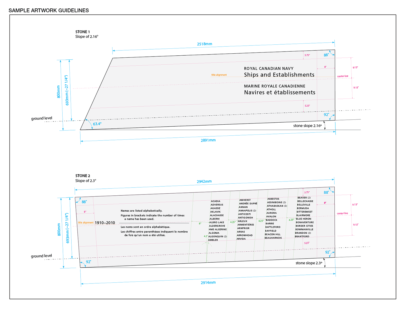
The slope of the site followed a straight line (LINE A), not the curved line (LINE B). For this reason, each the slope of each individual stone varied.

We extrapolated on the site plans to provide the building contractor precise slope calculations for each stone slab, assuring the text would be level once installed.

Shown here is a sampling of artwork guidelines with respect to final geometry and slope calculations. Special attention was given to assure visual continuity from one stone to another.
During concept exploration we proposed slanting the text columns forward, to relieve tension in relation to the material seams. This created a forward motion reminiscent of an actual wake (a track left by a moving body in water)


We surveyed other examples and best practices. Seen here is the Vietnam Veterans Memorial, DC. This memorial demonstrates a fundamental principle of type setting, which is to carry a clear horizontal text base line all the way across the length of any given piece (in this case being the monument itself).

Early on in the project, it became apparent that the above typographic principle was not going to work in application to 'the Wake' geometry. The form is too narrow, and the text closely sandwiched between the top and bottom edges. As you can see below, following the text baseline from left to right is visually jarring. We needed to intentionally - and masterfully - break out of a typical typesetting grid.

I was already familiar with all the other messaging components on this site, having provided design services for the original monument build in 2012. It was easy therefore to reference all previous typographic decisions to assure a holistic design approach.

The final result is perfection! Go see it in person!!


